
Client: TasAlert (Tasmanian Government)
Project Scope: Branding and Identity Design
Goal: The goal of the TasAlert branding project was to create a clear and accessible graphic device featuring the 'Connected Tasmania' icon and TasAlert wordmark in a monochromatic style, ensuring consistency across all platforms and compliance with the Tasmanian Government's Style Guide.


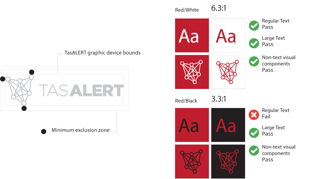
The TasAlert branding is defined by a minimalist, impactful style using red and black as the primary colours. The graphic device appears in monochrome, ensuring accessibility and clarity, with red serving as the main decorative colour. As a government initiative, the design follows WCAG 2.1 AA standards for colour contrast, ensuring compliance across all digital and physical materials.